this is one of the oldest modules in darktable. it appeared to me that it probably lacks an example to discover how useful it can be … so here goes the example.
this started off to be a wrapper around the gegl:whitebalance operation, which works in Lab color space and is able to give dark and bright colors a different color tint, interpolating between the two for mid tones.
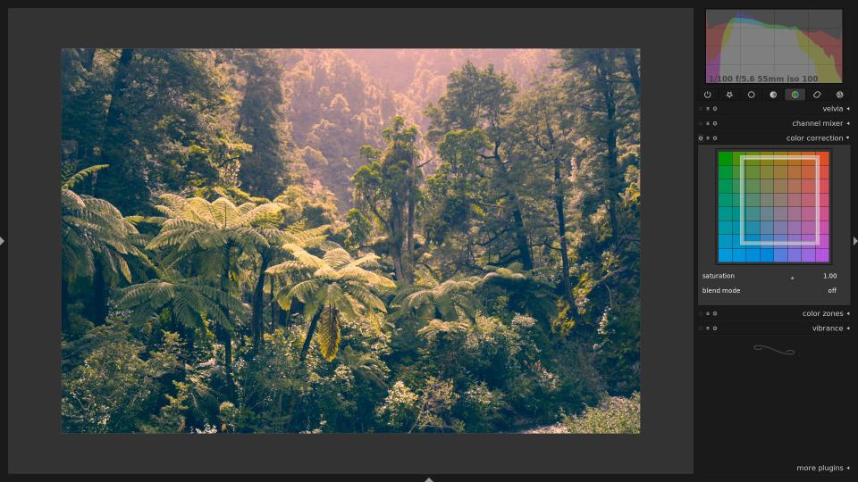
so suppose you have the following image:

and want to adjust white balance for the highlights and the shadows separately. you can do that by pulling the box inside the color panel around:

with the box open, you’ll notice that two edges are dark, and two are light. these define the color shift for shadows and highlights, respectively. in the example above, i pulled highlights towards red, and the shadows towards blue. play around with them, to get a better feel for it:

you can also use the mouse wheel to adjust saturation:

and finally, to give you a real-world example, so you don’t discard this module as b-movie relevant only. the following is an image which has a double-whitebalance situation. the dark rocks in the foreground have a bluish tint, whereas i like the warm tones of the cliff and the sky in the background.

by leaving the light edges where they were, and just dragging the dark edges a bit up towards yellow, you can achieve the following (screen capture with active snapshot, to make the comparison more obvious. left: after, right: before).

note how the sky and the hill on the left hardly changed at all, while the rock in the foreground now nicely blends into the warm white balance of the bright parts.
sidenote: this also works for black and white images, to tint your image after monochrome conversion.


Now you say it, I can see that down and left edges appear to be a bit darker than up and right, but I've always thought it was a little perspective thing.
The separator can be moved towards the sides and rotated by 90 degree (and then moved up and down...)
An interface with two separate draggable markers (let say a black and a white disc) may be more intuitive and discoverable... As it is, only two edge intersections are significant (dark-dark and light-light), right?
you have two parameters to change, first you need to lower the fontsize in darktable.gtkrc and then the panel width to something like 220...
/Henrik
If very usefull.
Can you do a tutorial about HDR in Darktable ?
I never get good results with this.
I mean, it would be nice to run darktable in low resolution when making screenshots for a blog post. 1980x1080 is too big for a screenshot, all labels become too small when downscaled.
Donc :
le bas-gauche de l'image sera dans le bleu donc 6 ou 7000 K
le bas-droit sera dans le rose-rouge donc 3 ou 4000 K ?
Deux des côtés du rectangle concernent les couleurs sombres, et les deux autres les couleurs claires. On peut donc ainsi renforcer le caractère froid des ombres et réchauffer les couleurs lumineuses ... ou l'inverse.
Screencast ?
http://www.darktable.org/2012/03/upcoming-features-conditional-blending/
and
http://www.darktable.org/2012/07/some-enhancements-to-conditional-blending/
Both is currently only available in the git build development version.