

disclaimer: this is only to tease you and will not make it into the next release, but the one after …
when reading gui-guidelines, most of them seem to be too general, or too specific for a certain kind of programming environment (gnome and gtk, qt, etc).
for our purposes, i found the fundamental principles of the bauhaus school to be more appropriate. radical simplicity, no unnecessary shape or line, such as a pseudo 3d-bevel-border around ui elements. the underlying grid should be visible because all elements are aligned, not because it is drawn. only simple shapes are allowed, and everything should integrate seamlessly into the background of the panel.
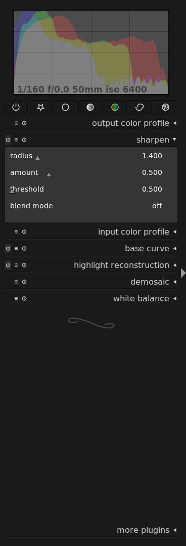
the second aspect about bauhaus is functionality. we want that, too, so without further philosophy, here is a use case example with the sharpen module:
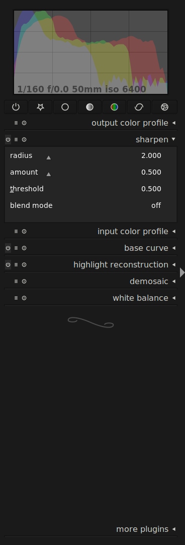
the first image shows the unfocussed module, which presents itself as plain text and minimal equilateral triangles representing the slider positions. note that all borders and distances follow the same grid, the slider’s baseline is the text baseline, and everything uses the same font.
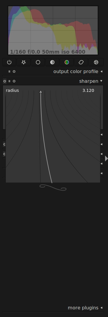
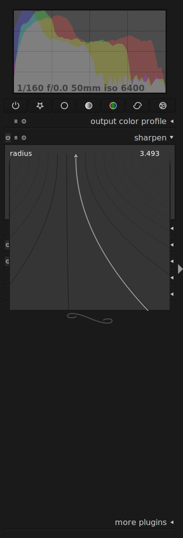
these sliders operate as you would expect, by clicking/click dragging somewhere on the drawing area (you don’t need to hit the triangle). double click will reset to the default value. for further fine tuning, you can press the right mouse button, to expand a loupe mode, which will give you zoomed-in control over your value. the mouse will bend the light grey line and move the triangle in smaller steps as you move the mouse to the bottom of the area. this area is large enough to play around with the mouse while actually watching the resulting image, not the slider.
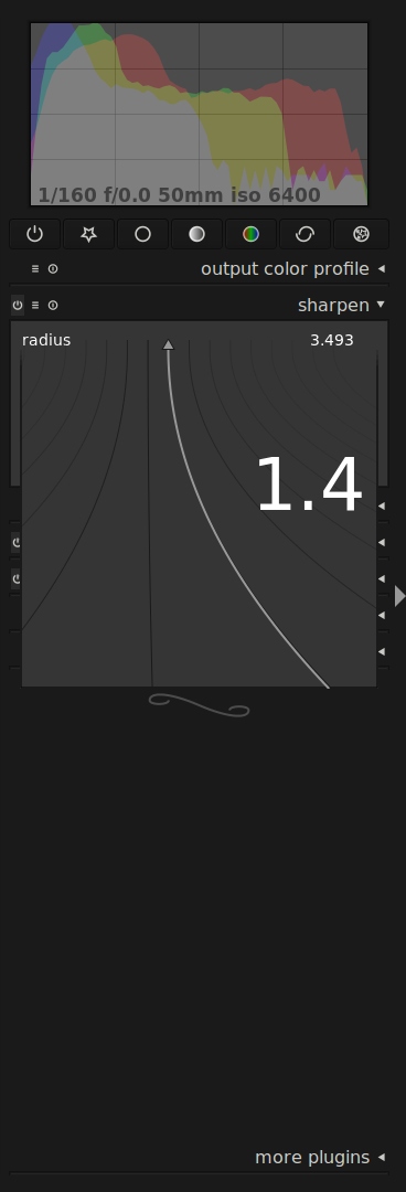
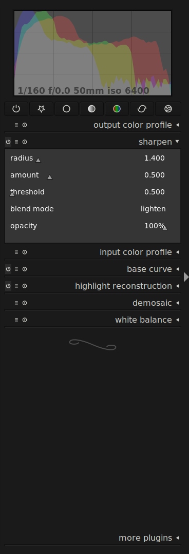
the last image demonstrates the same functionality we already have in master. while the fine tuning area is expanded, you can just start typing a desired number and press enter to accept it.
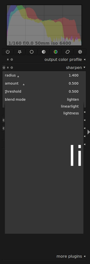
so why do we need a new slider you may ask. it’s not about the slider. it’s about unifying the interface, both in design and in functionality. to illustrate what i mean, here goes another example, a combobox this time:
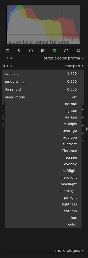
one more thing to note about functionality is the included label. this way translations can vary in length wildly, and there is no need for an additional separation line in between label and the widget itself.
this combobox not only looks much the same as the slider, it also works much the same way as the slider does. mouse wheel works for increment/decrement, (right, here also left)-click opens the popup (which is actually the same gdkwindow in the code), and typing will work, too. here it creates a filter and only shows you entries which start with the string you typed. pressing enter will accept the top entry in the list.
these are no mockups, you can have a fully functional test run by checking out the bauhaus branch.


Darktable is getting better and better at a very impressive pace. It's not an "alternative" anymore; there are many valid reasons to choose it in the first place, besides being "free" (in both senses of the word). I didn't have any major problems with the interface, but I was always thinking that the sliders were a bit awkward - sometimes I had to type in order to choose a value precisely enough.
The new sliders look (and most probably feel) awesome! Perhaps you should file a patent, before Apple does and then starts suing FOSS projects left and right (I'm only joking... well, half-joking).
I'm not so sure about the combobox, but we'll see in practice.
I've always found Bauhaus extremely interesting - not so much when it comes to the results, as in terms of the underlying principles. Function-over-form; but not without beauty and elegance. Beauty, however, was somehow redefined in terms of functionality. As such, Bauhaus is certainly inspiring. I feel that this type of functional "elegance" is the essence of mathematics and engineering - all types of engineering, including software.
As an amateur photographer, Linux user and CS major, I can only hope that you keep up the good work!
PS. Please forgive the mediocre English.
Here are my main issues I have with it:
- the graphical element of sliders is now extremely retracted compared to the text. The small graphical triangle element has no clear reference to a minimum or maximum value. This makes it more difficult for me to get an immediate feeling for the selected value within its range. I now have to refer more to the text, which gets even more prominent.
- when switching into fine tuning mode, the main graphical elements are curved, mainly vertical lines. I am impressed by the mechanism of different levels of fine tuning, but i feel that the manipulation elements have a higher dominance now than the slider value itself. A lot of movement of the vertical lines that try to control a small triangle on the (virtual) horizontal line. For me the horizontal line should get more attention as it represents the value I want to change.
Generally speaking I would wish to have a more prominent horizontal feature for sliders and less text dominance.
As said, these are just my personal impressions and I am really looking forward to see the further progress.
I understand the Bauhaus approach, but I am not entirely convinced about the whole "no unnecessary shape or line" thing. For instance, take a look at the slider. The handle appears to be floating, rather than having a guided rail. There is no longer a sense of a left and right boundary. Also, the handle floats over the label, interfering with the readability of the text. The visual appearance is better than the current release, but at least that has a sense of relative value.
Also, when talking about unnecessary lines, what is the curly line below the plugins doing there? ;-)
And the curly swirl is nice. :D