In other languages: Français, Italiano.
Following the tradition, darktable 2.6 was released for Christmas. 2018 has been a year of renewal for darktable, with many major features introduced by recent contributors.
The announcement and release notes for this new release can be found here: /2018/12/darktable-260-released/.
Among the new major features:
-
A new retouch module, similar to the spot removal module with smart cloning (“heal”) and ability to act on each level of detail individually.
-
A new filmic module, able to manage most aspects of the tone of an image in a single module.
-
A complete rework of the color balance module, which can now be seen as a color-aware variant of levels, and can do most adjustments automatically thanks to new color picker buttons.
-
The ability to guide the blurring of the blend mask, to select an object precisely with minimal effort.
As with all darktable major release, this version changes the database
format so it is not possible to downgrade to previous versions after
launching darktable 2.6: don’t forget to make a backup of your
database (~/.config/darktable/ directory) before doing so.
Major features
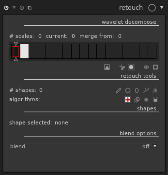
A new module: retouch
While darktable is primarily focused on raw development, recent versions introduced features like liquify, traditionally available only in pixel-oriented editors like GIMP. One more important step in this direction is done with the new retouch module, which essentially supersedes spot removal, together with frequency-splitting editing for fine retouch.
Improvements compared to spot removal
The interface has a lot more buttons than spot removal, but everything you could do with the later is also possible in a similar way with retouch.
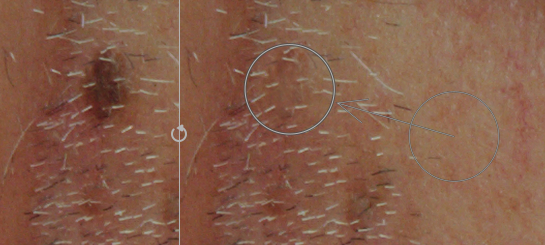
Just like with spot removal, you may select a shape (circle, ellipse, path, or brush, which wasn’t available with spot removal) and click on a part of the image you want to hide. The module will clone another part of the image to hide it. Drag instead of clicking to choose the source of the clone, or adjust the controls after the fact.
Many details will make your life easier than before:
Seamless cloning, better results with less efforts
By default, the clone uses a “seamless cloning” algorithm (borrowed from GIMP’s “heal” tool), which adapts the source to the context where it is cloned. You don’t need to clone exactly the right piece of image. Let’s take a common example: a small defect in a not-completely-uniform sky:

A bad attempt to fix this with the clone tool would give:
The piece of sky copied to mask the defect is a bit darker than the place where it’s copied. It’s not obvious while the controls are displayed on the image, but the final image is really bad:

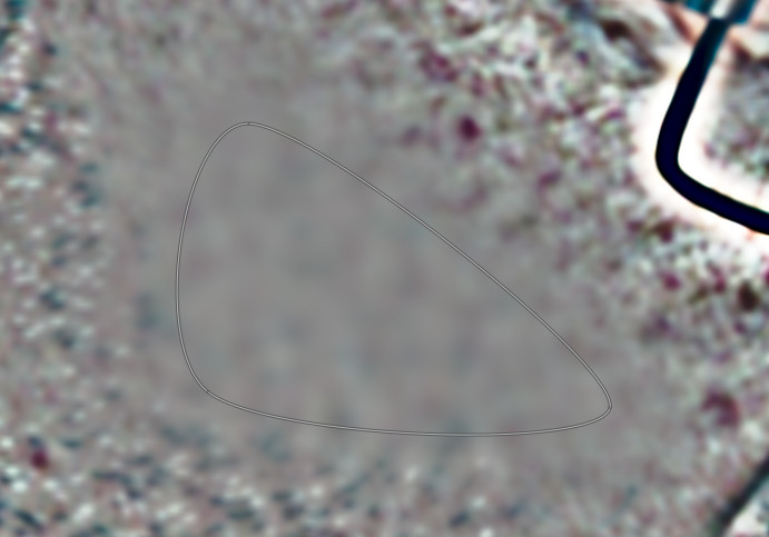
The same retouch with the new “heal” tool
(![]() ) gives this:
) gives this:
This time, the final image is indistinguishable from a real sky without defect:

Even when cloning pieces of images of totally different colors, the “heal” tool behaves surprisingly well. Let’s push the module a bit:
The white patch is cloned to the blue shirt, the blue shirt to the red one, and the red one to the white one. Each time, the local contrast is kept, but the overall color and luma of the patch is adapted to fit the destination.
The basic “clone” tool (![]() ) is
still available for the rare cases where you would want it.
) is
still available for the rare cases where you would want it.
Fill and blur, when you don’t have anything to clone
In addition to the “clone” and “heal” tools (which work only when you
have a piece of image to duplicate on the spot to remove), retouch
provides a “fill” tool (![]() )
(fill a shape with a color) and a “blur” tool
(
)
(fill a shape with a color) and a “blur” tool
(![]() ) (apply a blur to soften a
part of the image tools). These tools are most useful for
split-frequency editing, see below.
) (apply a blur to soften a
part of the image tools). These tools are most useful for
split-frequency editing, see below.
One activation, multiple strokes: continuous add
Tools can be activated once for multiple strokes. Just use Control-click on one of the point, line, ellipse or path tool (instead of a normal click), and the tool will remain active until you explicitly deactivate it. This is very convenient when fixing many spots on the same image, compared to the previous flow where one had to re-click the tool’s button for each stroke.
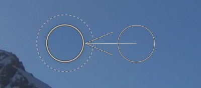
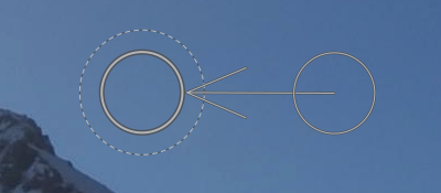
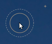
Source patch visualization
For “clone” and “heal” tools, each stroke consists in a source and a destination. With a simple click, one sets the destination and by default darktable picks an arbitrary location for the source. One can already set both source and destination with a simple mouse action by dragging from destination to source.
Retouch introduces a more advanced mechanism:
- While moving the mouse over the image, the future destination is marked with its shape, and the source is marked with a small cross:
-
To select a source, use Shift-click on the image. The cross is placed at the mouse location and won’t move until you select the destination, with a simple click. This is interesting combined with the permanent activation of the tool mentioned above: the source for multiple strokes will be located at the same place, relative to the destination.
-
A variant: use Control-Shift-Click instead of Shift-Click. This also sets the source location, but this time it will remain fixed in absolute coordinate instead of relative to the destination.
Split-frequency editing
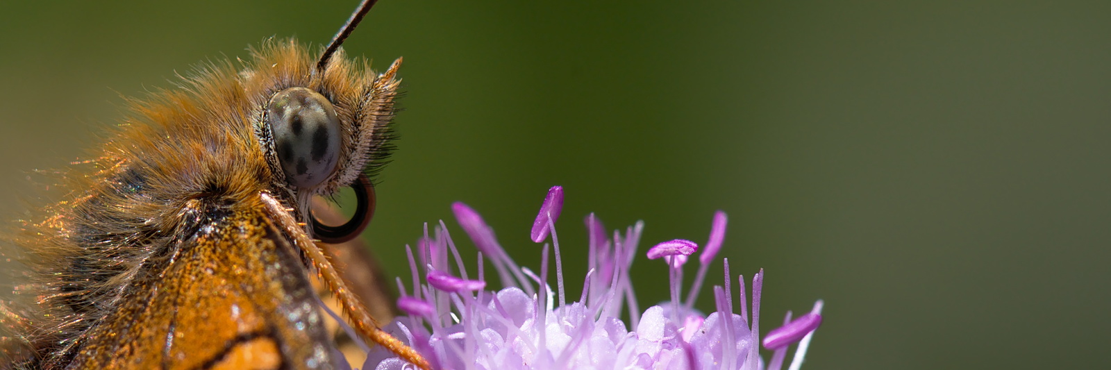
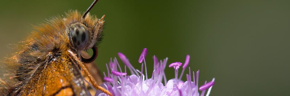
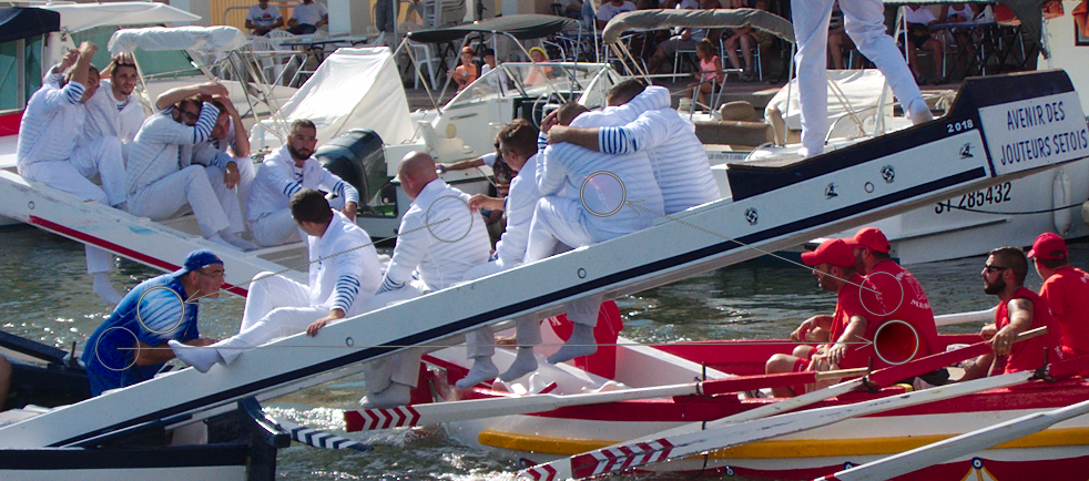
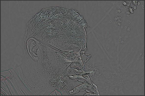
A common issue with photo retouching, typically for portrait, is that you want to hide spots, and sometimes reduce local contrast to make the skin appear softer, but keep the skin’s texture. A brutal blur would make the skin overly soft and will give at best an “obviously post-processed” look. Let’s take this image as an example (taken from the pixls.us PlayRaw contest “Hillbilly portrait”):
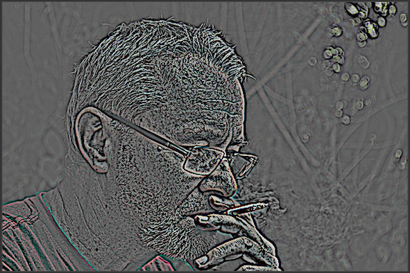
A common technique for this kind of retouching is to split the image into several images corresponding to different levels of details, and then combine the images together. This is what GIMP’s wavelet decompose plugin does, for example. After splitting, one gets a blurry image corresponding to the coarse details, and one or several images containing details only. In our example, we get scales of details:
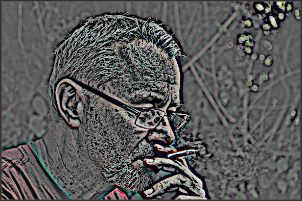
And the so-called “residual” image, i.e. the image where all other levels of details have been removed:

This kind of transformation is used internally by the equalizer module, which allows you to increase or decrease the importance of each level of detail in the image. While equalizer works globally on the image, retouch allows you to select the level of detail and the portion of image you want to work with.
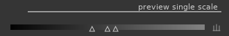
In the retouch module, this corresponds to the “wavelet decompose” part of the GUI:
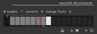
This part shows one rectangle per scale (fine-grained on the left,
coarse-grained on the right). The dark rectangle on the left
corresponds to the full image, and the white one on the right to the
residual image. By default, darktable always shows the final image, but
you can visualize the details scales and residual image by clicking
the “display wavelet scales
( )
button. The currently selected image appears with a red rectangle.
Move the bottom slider to change the number of details scales to use.
Depending on the zoom level, some details scale may be finer than your
screen resolution, hence unusable. The grey line above the scales
shows which scales are visible at the current zoom level.
)
button. The currently selected image appears with a red rectangle.
Move the bottom slider to change the number of details scales to use.
Depending on the zoom level, some details scale may be finer than your
screen resolution, hence unusable. The grey line above the scales
shows which scales are visible at the current zoom level.
When viewing the details scales, contrast may be too weak or too strong so the module proposes a levels adjustment (which apply only on the on-screen preview, but does not impact the final image):
Each of the tools presented above (heal, clone, fill, blur) is usable on any of these scales. Think of them as layers obtained from the source image, and re-combined together after retouching to obtain the final image. This is where “fill” and “blur” tools make most sense: “fill” defaults to an erase mode where the fill color is black, which corresponds to remove the details when used on details scales. One can also pick a color and fill with this color (most useful on the residual image scale). Using “blur” directly on the image usually results in clearly visible post-processing, but using it selectively on scales results in very subtle effects.
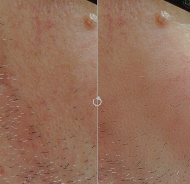
Example 1: spot reduction instead of spot removal
Let’s focus on the spot below the glasses. If we want to completely remove it, it’s pretty easy to do so with the “heal” tool. Now, what happens if we decide that we want to keep it, but reduce it to avoid drawing the attention. We can just remove it from the coarse detail scale (scale 6 in our example). The spot is not visible on the residual image, so removing it from the details scale is sufficient. The “heal” tool allows us to do that cleanly, but when dealing with the details scale, the “fill” and “blur” tools can also give good results. Here’s the result on scale 6 (before on the left, after on the right):
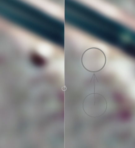
The final image will be transformed as follows:
Now, we may decide that the healing we did on scale 6 should also be applied on scale 5. We can redo the same thing manually, but we can also use the top slider, called “merge scale”, to automatically replicate shapes to multiple scales. Any shape created on the right hand side of this slider will be replicated on all finer scales up to the merge slider (except if the slider is completely set to 0, which means deactivate the merging). By setting the slider to 5, we apply our healing to both scales 5 and 6, and get the following:
If we move the slider further to the left, the spot disappears progressively. Using the same principle, we can remove marks on the skin while preserving the hair of the beard:
(Just one “heal” shape on scale 7, propagated to scale 5 using the merge slider)
Example 2: playing with the skin’s texture
If we want to change the texture of the skin on the cheek, we can apply a blur on a shape like this:
and get the following before/after result:
Obviously, this kind of retouching should be done with great care: when pushed too far, one gets an overly artificial look. When unsure, you can always get back to your retouch and use blending with an opacity lower than 100%, or change the opacity or blur radius of each shape individually.
Example 3: having fun with the residual image
Just for fun (do not reproduce at home, ugly images to be expected!), we can get a tattoo effect by using the clone tool on the residual image:
While not really elegant, this example illustrates the “split-frequency” principle: we’ve kept the fine details from the cheek, and cloned the coarse ones in the residual image.
New module: filmic
The filmic module was designed to reproduce the good properties of analog film, while giving you the easy controls of digital photography. It can be used on any image as a replacement for the base curve module, and is particularly adapted for images with a high dynamic range, i.e. a large difference between brightest and darkest areas.
Let’s take an example of such image (taken from the pixls.us PlayRaw contest “Backlit”):
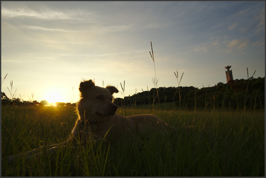
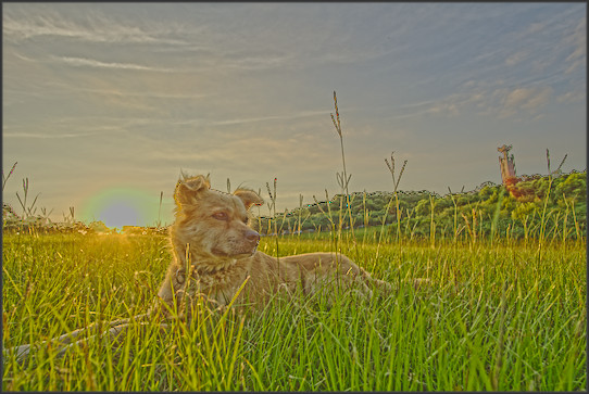
A common approach to deal with high dynamic range images is to compress the global contrast while retaining the local one. darktable has several modules able to do this: tone mapping, global tonemap, shadows and highlights, and since darktable 2.2 the exposure fusion mode in the base curve module. This contrast compression works to some extend, but results in artificial look when pushed too far. What you typically want to avoid is this (using tone mapping, contrast compression set to the maximum):
The filmic module shows that another approach is possible, and usually gives more natural results. It considers pixels individually, without trying to distinguish between local and global contrast. If filmic compresses the contrast too much, it is still possible to recover local contrast with the excellent local contrast module for example.
filmic is meant to be used without the base curve module (activated by default in darktable). The base curve comes very early in the pipeline and yields a contrasty image where highlights are often blown out. Recovering details lost by the base curve is difficult. On the other hand, just disabling the base curve usually results in fade images, lacking contrast and saturation. Other contrast enhancement techniques must be used to compensate for this. filmic comes later than base curve in the pipeline, and gives more control to exploit the dynamic range of the output image properly.
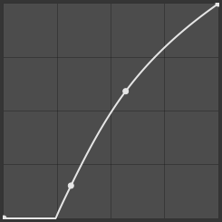
The first thing filmic does is to apply a logarithmic curve to the image, so that the “stops” (powers of two in luminance in a linear space) are spread evenly on the histogram.
A source of inspiration behind filmic is analog film. One difference between analog film and digital sensors is the way they react to overexposure. Digital sensors have a clipping threshold above which everything is considered white: they can’t distinguish between pixels slightly above the threshold and pixels grossly overexposed. Analog film respond differently: contrast is reduced progressively as the image is overexposed, without this threshold effect. This allows analog films to render a scene with a high dynamic range on a medium with a lower dynamic range, while keeping contrast and saturation in the midtones.
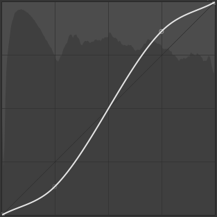
Similar effect can be obtained in the digital world by applying an S-shaped curve to the image, as long as the highlights are not clipped. With the tone curve module, one can draw a curve like this one:
The second thing filmic does is to apply such curve, but instead of providing the curve manually, the curve is computed automatically from a set of parameters. This makes it easy to balance shadows, highlights and midtones.
Example image
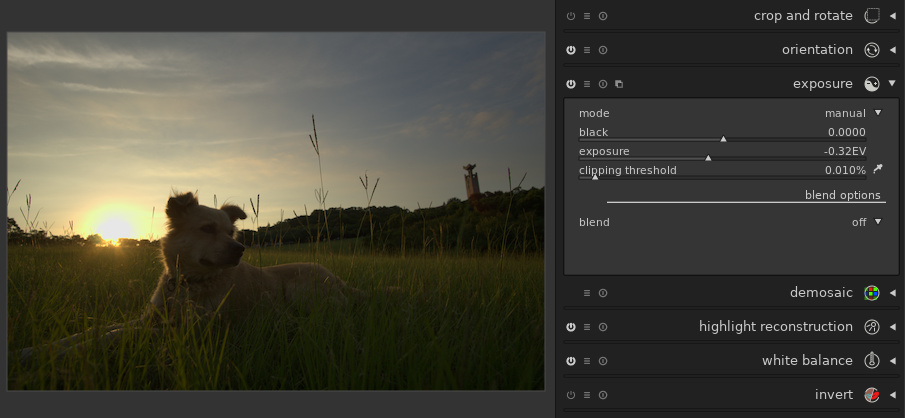
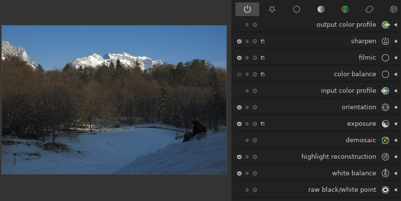
Let’s process our image with this module. Before applying filmic, we first need to disable the base curve module, and then to adjust the exposure. No pixel should be overexposed nor underexposed. In our case, we need to reduce the exposure to avoid overexposing the sky:
For the automatic setting to work best, it is also advised to use the “AMaZE” mode in the demosaic module. Activating a noise reduction module coming before filmic in the pipeline (e.g. denoise (profiled)) may help, too.
Logarithmic shaper
The first thing displayed in the filmic module is an overview of the curve applied to the image. The curve is not editable directly, the point of the module being to compute the curve from the sliders below.
To get a good starting point, filmic provides an “auto tune levels” picker. By default, it considers the whole image, and sets the three sliders above based on average luminance, brightest area and darkest area:
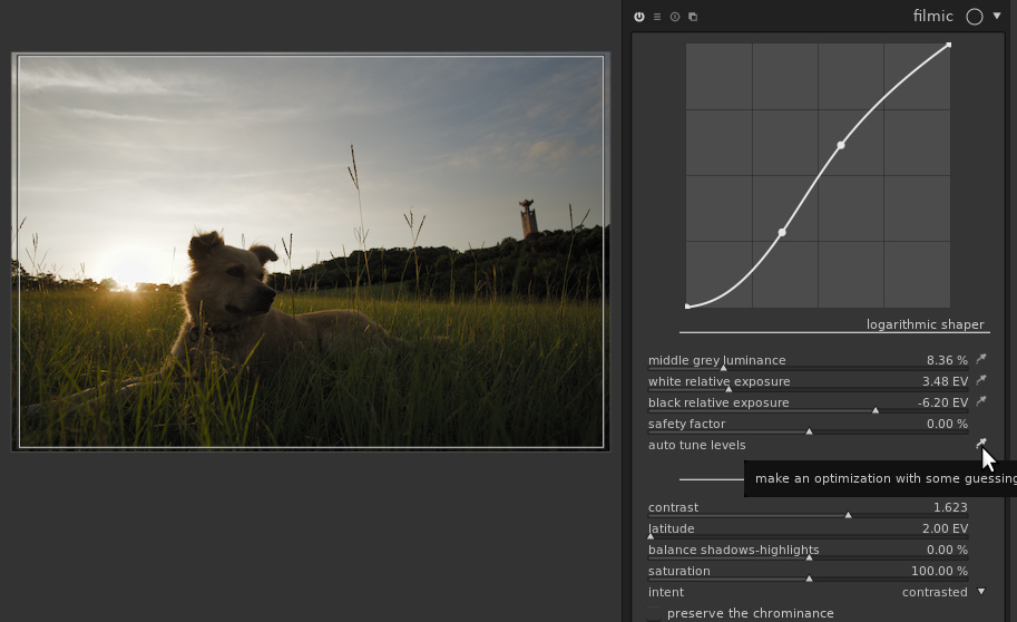
At this point, the histogram should fill-in the full range, but no pixel should be under or overexposed. If it is not the case, you can fix it with the “safety factor” slider: pushing it to the right compresses the dynamic range (so the histogram should appear centered, with empty parts at the left and right), and conversely, pushing it to the left extends it so shadows and highlights will start clipping. The black cursor can be set by guessing the dynamic range of the image (on a contrasty enough image, this is the dynamic range of the camera, i.e. around 14 EV on a high-end camera or around 10 EV for an average compact camera). The black cursor can be set to the value of the white one minus the dynamic range. Alternatively, one can move the cursor to let the histogram fill its horizontal axis.
In our case, the auto-tuner did its job properly, so we’ll keep the sliders as they are. The histogram is spread over the dynamic range of the target image. No pixel are overexposed:
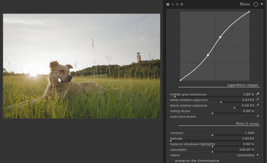
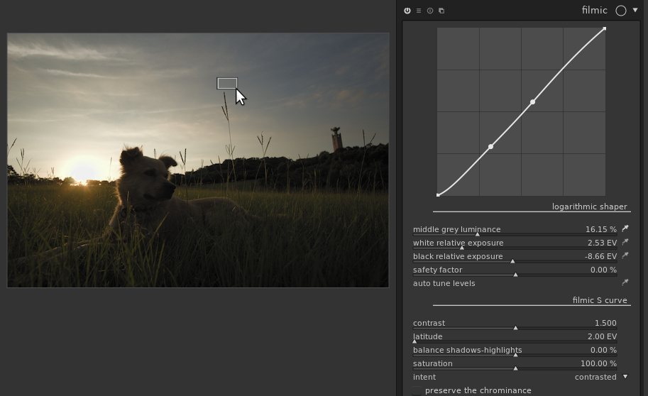
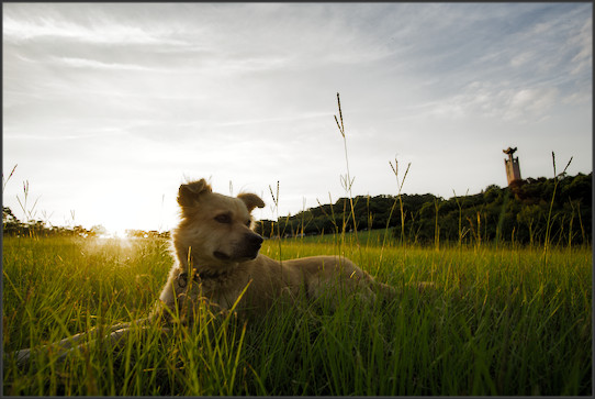
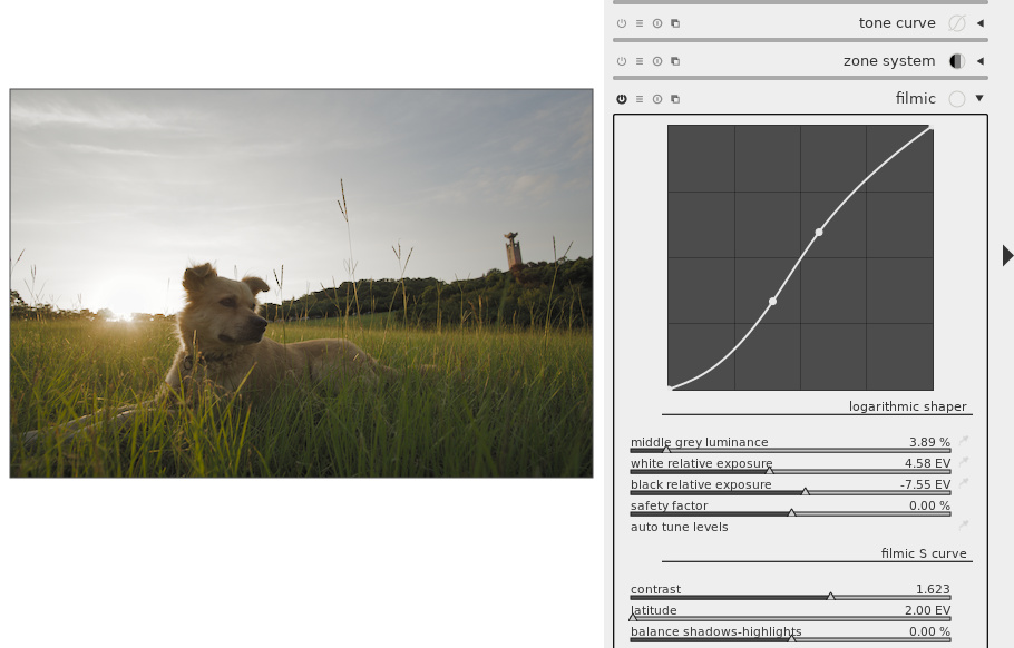
Now comes the magic: the “middle grey luminance” picker allows us to chose which part of the image will be considered as middle grey (50% luminance). For example, if we set it on the cheek of the dog, we get this:
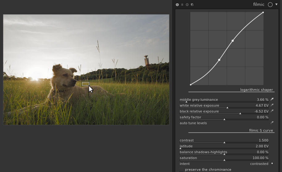
If we select the nose of the dog, which is much darker, we get this brighter image:
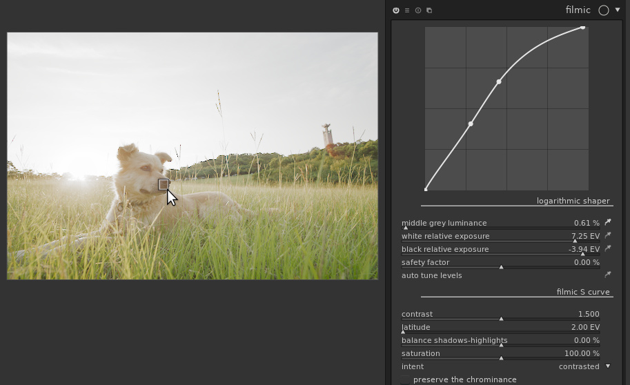
Note that we’ve selected an area which is almost the darkest part of the image, so we’re really putting filmic to the test and shouldn’t hope for a great result. Still, the nose is properly exposed and the rest of the image is as good as it can be given the constraints.
On the other hand, if we select a bright area in the sky, the overall exposure is lowered to get proper exposure on the sky:
For all these images, the black and white points are kept, no over or underexposure. In the end, picking the grass behind the dog is probably the best option here, but it’s a matter of taste:
Using the full image with the “middle grey luminance” slider is also a safe choice; this is what “auto tune levels” does.
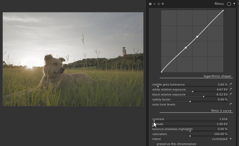
S-shaped curve
Let’s now move to the second part of the module: the S-shaped curve. Basically, it will increase the contrast in the midtones (the “contrast” slider) and compress shadows and/or highlights. You may not have noticed it, but filmic has already been doing so since we activated it, as the “contrast” slider is set to 1.5 by default. If we disable the S-shaped curve (setting “contrast” to 1), we get a duller image:
On the other hand, we can add more contrast than done by default:
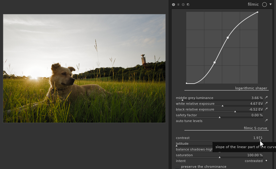
Of course, at some point increasing the contrast will result in loosing information in shadows and/or highlights. The curve at the top of the module allows you to see what information is lost: ideally the curve should not touch the top or bottom of the frame. If you get this curve, texture is lost in the blacks:
In other words, either you’ve destroyed your shadows, or you are purposely clipping to get deeper blacks.
The sliders below “contrast” allow you to fine-tune the curve:
-
“latitude” gives the range of the image considered as midtone, in which contrast will be increased.
-
“balance shadows-highlight” allows giving more room either to shadows or to highlights.
-
The “intent” drop-down controls the interpolation between points of the curve. The default usually provides good results but can also go really wrong (e.g. produce a non-monotonic curve) when you push the parameters to their extreme. Try other modes when this happens.
Increasing contrast often results in an increase of saturation in the shadows, and increase in the highlights, which can result in out-of-gamut colors. The “saturation” slider allows decreasing the saturation in the extreme shadows and highlights to avoid this. On the other hand, in highlights, darktable usually has to chose between preserving the luminance and the chrominance. By default, it preserves the luminance but the checkbox allows doing the opposite. When preserving the chrominance, resulting images are often perceptually over-saturated, and will need some extra-care later in the pipeline (e.g. set the output saturation in color balance to 75%).
There’s a hidden section “destination/display”, useless for most users. Expect ugly images if you use it without reading the manual and knowing what you’re doing!
Final touch and local contrast
The contrast has been compressed in the sky, but we still see some texture there. If we want to increase local contrast in the sky, the local contrast module with a parametric mask on the brightest part of the image gives this:
It is also possible to disable the effect of filmic using masks, e.g. excluding the highlights to avoid contrast compression there. Some feathering of the mask will usually be needed to avoid sharp edges or halos.
More documentation
This section gave you an overview of what’s possible with the filmic module. Obviously, you should read the darktable manual for more details. For more information (more technical details, comparison with other techniques, examples on real-life images, …), you may also read the article “Filmic, darktable and the quest of the HDR tone mapping”, by Aurélien Pierre, the creator of the module.
Duplicate manager in darkroom
darktable allows you to maintain several history stacks for the same image. In lighttable, using the “duplicate” button in the selected image module, one gets a duplicate of the image: the RAW file is not copied, but darktable keeps two distinct history stacks for this file.
darktable 2.6 makes it easier to work with duplicates, with a new module on the left sidebar of the darkroom:
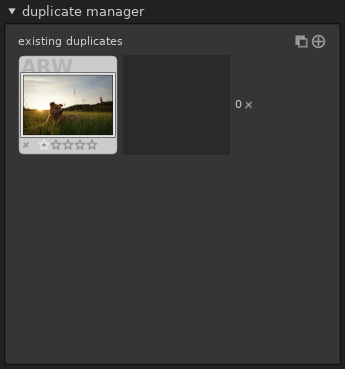
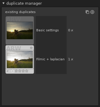
First, obviously, this module being in darkroom, it allows you to deal with duplicates without leaving the darkroom. Second improvement, a short comment can now be associated to each image. Suppose we want to compare our image developed with filmic with a development using exposure fusion in the base curve one. We can start with basic exposure adjustment and keep this version for further development:
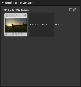
Then, clicking the “create duplicate of the image with same history
stack” button ( )
yields a second duplicate on which we can apply our filmic-based
processing:
)
yields a second duplicate on which we can apply our filmic-based
processing:
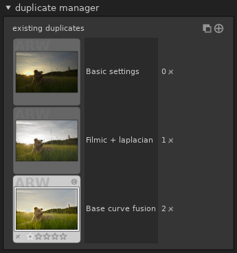
To get another version, we select the first one (double-click) and create another duplicate:
To compare the images, a single long click on any duplicate shows this version of the image with a “fit to screen” zoom level. You may have to keep the mouse pressed until the image is re-computed to get the overview the first time, but the operation is immediate afterwards so you may click and release several times to get an instant before/after comparison.
Notice that the thumbnails are only updated when you leave an image, so the thumbnail for the image being edited is usually not up to date.
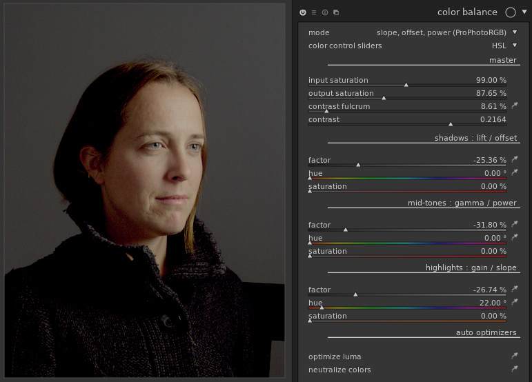
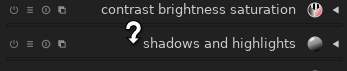
Revamp of the color balance module
The color balance has been considerably improved. Although its name contains “color”, it is actually a much more general module. It can adjust levels pretty much like the levels module, and can now also tweak the contrast with a curve somewhat similar to the S-shaped curve of filmic. Obviously, you can also still adjust the colors to add or remove a color cast in the shadows, highlight and midtones separately.
The module gains two modes to work in ProPhotoRGB mode. Also, you now have the choice between the old RGBL (Red, Green, Blue, Luma) sliders, and HSL (Hue, Saturation, Luma).
Let’s play with the module on an image with multiple white balances. This is the original image, with only the basic modules activated, and base curve disabled:
The snow is obviously white in the real scene, but the snow exposed to the sun reflects the sun’s light, while the one in the shadow reflects the sky’s light, much bluer. The color picker module in the left sidebar of the darkroom allows visualizing and quantifying these color casts:
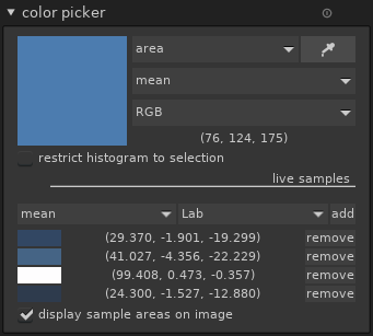
(The negative value for the ‘b’ channel represents the blue color)
The color balance module now has color pickers to neutralize the colors. On this image, the global optimizer works rather well. After one click on “neutralize colors”, the blue cast in the shadows is reduced:
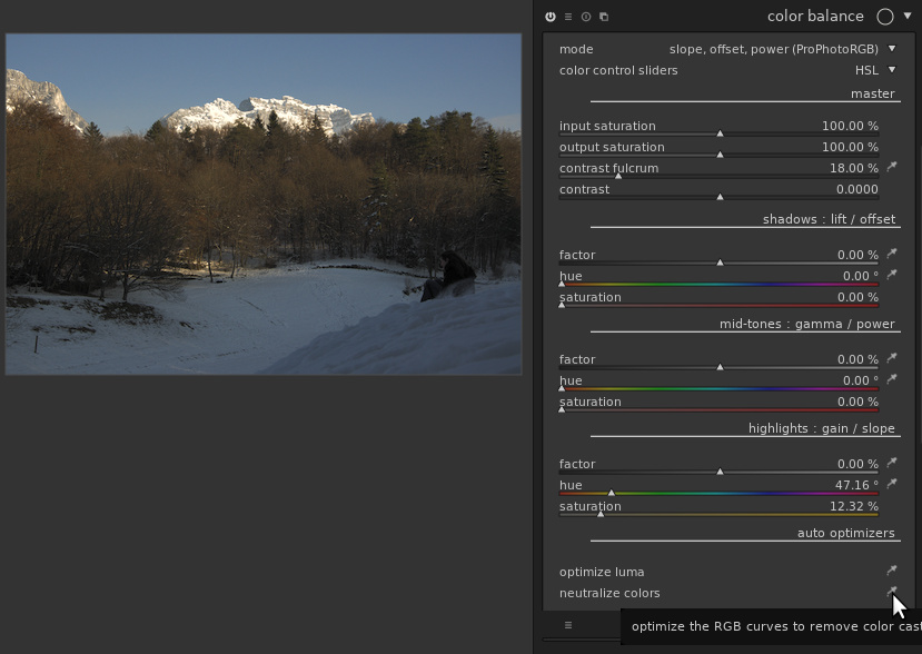
Looking more carefully at the patches selected by the picker, notice that the ‘b’ value is now much closer to 0:
If the global optimizer guesses wrong, it is possible to specify color patches for highlights, shadows and mid-tones (preferably in this order) separately with the corresponding color pickers, and if needed re-launch the “neutralize colors” (called “neutralize colors from patches” once you have selected these patches).
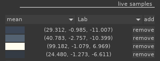
Similarly, the tones can be adjusted similarly to the levels module, either with the global “optimize luma” or with individual pickers.
The “master” section at the top allows adjusting the global contrast and saturation. “contrast fulcrum” and “contrast” apply a curve, centered around the fulcrum, and with a slope given by the contrast. In other words, with a positive contrast, parts of the image below the fulcrum will be darkened and parts above it will have their luminance increased:
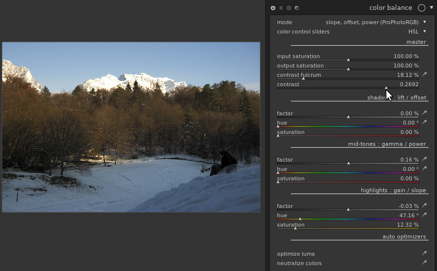
For sure, color grading is still the main intended use of color balance. For example, to get and old-style look with blue, faded shadows we can use the “shadows: lift/offset” section: set the factor to a positive value (so that the blacks aren’t fully dark), the hue to a blue color, and use the saturation slider to control the intensity of the coloring effect. This can lead to pictures like this one (image taken from a RAW edit of the Week contest):
In this example, the cursors have been pushed a bit far to get a clear effect, but the module can also produce more subtle effects, especially when combined with parametric masks. See for example the “orange and teal” presets added to the module in this version for example (first image before, second image after application):
Edge-aware bluring for blend masks
The “blend” feature of darktable allows selecting a part of the image, called the mask, and applying the transformation of a module selectively to this part. After creating a mask (drawn, parametric), one can soften the edges of this mask with a blurring.
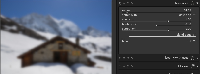
darktable 2.6 gives more control on the way mask blurring is performed. To understand how it works, let’s look at the two main kinds of blurring. The common one is “gaussian blur”, and gives roughly the same effect as an incorrectly focused photo. In gaussian blur, the value (luma and chroma) of each pixel is spread uniformly to the neighboring pixels. The influence of a pixel decreases with the distance. In darktable, Gaussian blurring is available in the low-pass module:
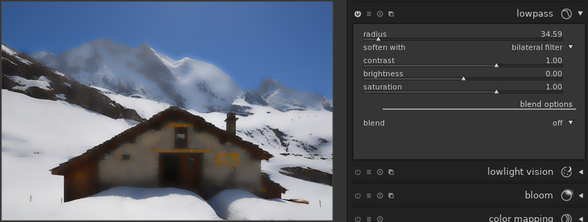
Another very useful kind of blurring is the bilateral filter, sometimes called “surface blurring” (because of the name of the corresponding tool in Photoshop), or edge-aware blurring. In this mode, the value of each pixel is spread to the neighboring pixels, but the influence of a pixel is also reduced when the pixels have different values. For example:
A similar blurring algorithm can be applied to the mask, but this time the mask is blurred, and the image being processed serves as a blur guide. This allows doing a very rough approximation of a mask, and refining precisely with the sliders.
Suppose we want to improve the color of the sky. In the color zones module, we can select the sky approximately with a drawn mask:
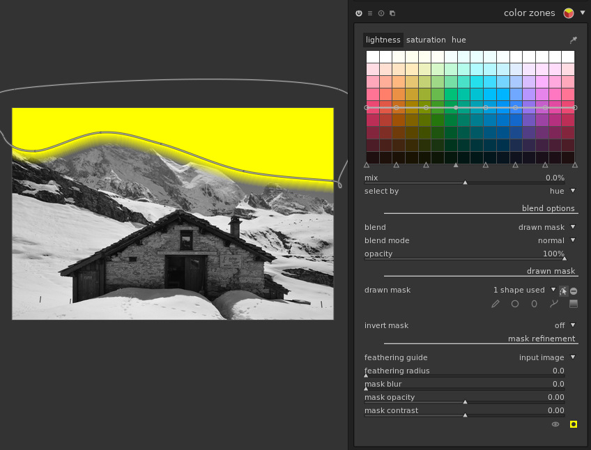
Obviously, a Gaussian blur on this mask (i.e. the only available with darktable 2.4) only makes things worse:

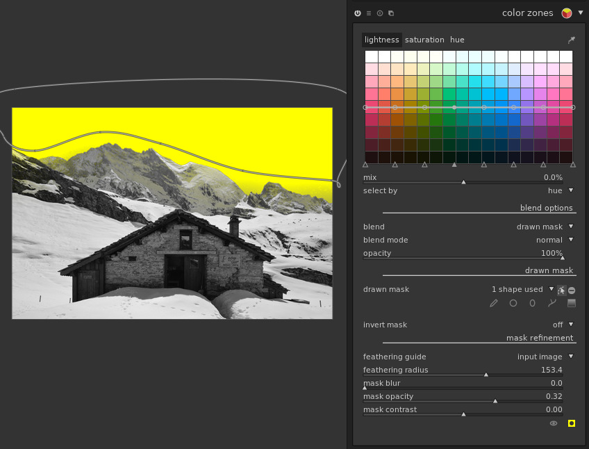
However, pushing the “feathering radius” slider, the mask automatically adjusts to the sky, without spreading to the mountains. The feathering reduced the opacity of the mask a little, but we can compensate this with the “mask opacity” slider. And voilà:
Note that by pushing the “feathering radius” and “mask opacity” sliders, one gets a tool similar to the “magic wand” selection of GIMP, often requested by darktable users: select a few pixels inside an area to select, and let the tool select surrounding similar pixels. For example, a brush stroke inside the house:
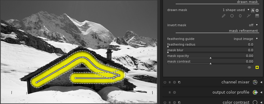
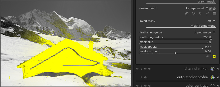
And now with feathering:
Lighttable and map improvements
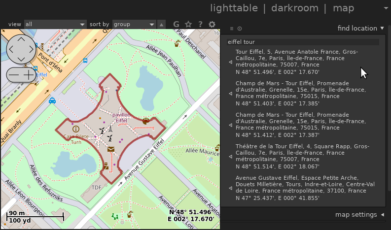
- Searching for a location from the map view was fixed:
-
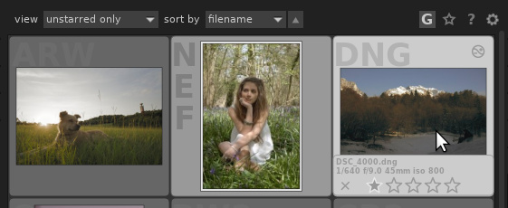
The look of the lighttable has been improved. The background text showing the image format was often unreadable because it was hidden by the picture. The state of the local copy is now displayed in the top right corner. In darktable 2.6:
Previously, the same configuration was displayed like this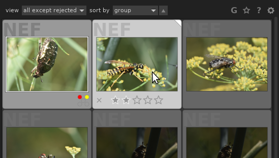
-
It is possible to display the image’s metadata as a thumbnail overlay in lighttable and filmstrips:
Once active, the informations are shown when hovering the mouse over the thumbnail: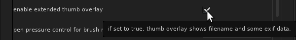
-
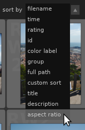
One can now sort images by aspect ratio (possibly after cropping within darktable):
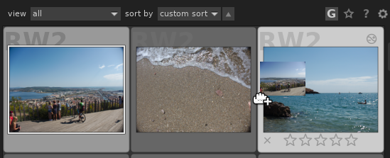
- It is also possible to specify the order manually, by selecting “custom sort” and then drag-and-dropping the images to reorder them:
-
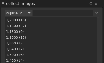
Collections can be filtered by aspect ratio, shutter speed (exposure) and state of local copy:
This allows in particular selecting by orientation: only portrait images (aspect ratio < 1) or landscape (aspect ratio > 1) or square (aspect ratio = 1).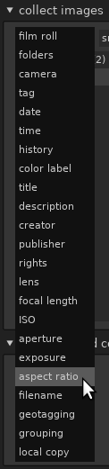
-
When selecting a filter to collect images, the number of images corresponding to each filter is displayed. In the example below, 13 images were taken at 1/2000 and 27 at 1/1600:
-
It is now possible to have scrollbars in lighttable and darkroom. They are disabled by default in darkroom, but can be activated if needed from the configuration (at the bottom of the “GUI options” tab):
The scrollbars appear around the central part of the interface: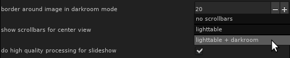 In lighttable, the scrollbars are the only way to move quickly within a very large collection of images. In darkroom mode, moving can be done without scrollbars by dragging the mouse on the image or by using the preview at the top left of the window, so the scrollbars are much less needed.
-
Support for groups of images has been improved. Groups of images can be created by selecting images and clicking “group” in the selected image[s] module. Once done, the “G” button at the top of the lighttable allows switching between the “collapsed” mode where only the group head is displayed, and “expanded” mode. In collapsed mode, actions like rating (stars) and color labels are now applied to the whole group.
-
Also, it is now possible to sort by group so that groups are kept together. The group representative is shown first, and other than grouping the order is the same as sorting by “id” (identifier).
-
The print module has been improved: one can now choose the type of paper, and when using TurboPrint, the complete TurboPrint dialog is displayed before printing.
-
The collect images in lighttable now has 3 modes to deal with hierarchical tags. When selecting a tag which isn’t a node leaf (i.e. a tag that has subtags), say, the “parent” tag:
-
A normal double-click selects only the images tagged with this particular tag. The search string is set to “parent”.
-
A control-double-click selects only the children, e.g. images tagged with “parent|child” but not “parent” only. The search string is set to “parent|%”, where “%” is a wildcard meaning “any string”.
-
A shift-double-click selects images tagged with the tag itself or any of its subtags. The search string is set to “parent%”.
-
Other important features
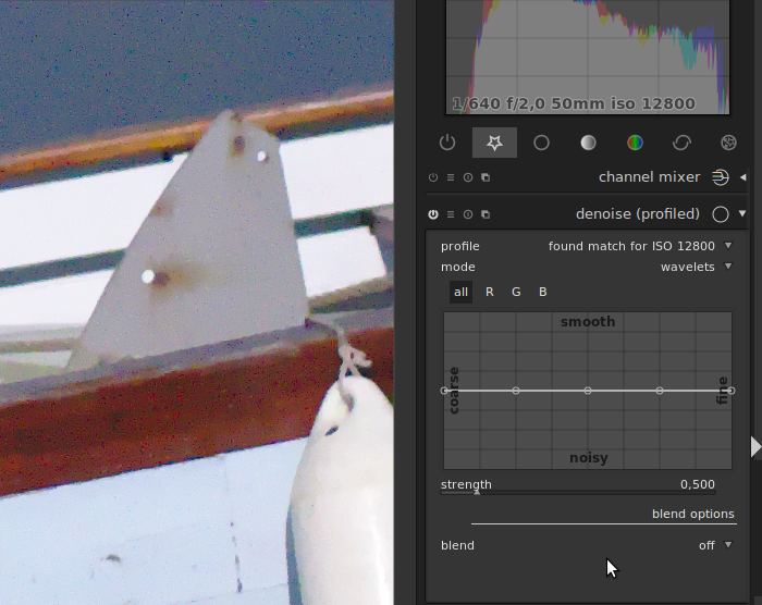
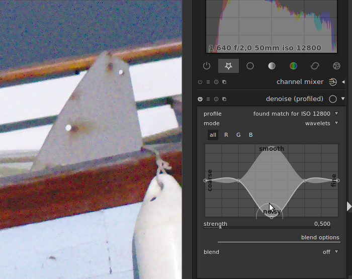
Finer control on noise for profiled denoise and raw denoise
New curves have been introduced to give finer control for the “wavelet” mode of profiled denoise as well as the raw denoise module. These curves allow controlling the strength of denoising frequency by frequency. In other words, you can adapt the strength of the denoising to the noise coarseness. The “all” curve allow to change the strength for all channels at the same time, while “R”, “G” and “B” curves allow changing the strength separately for red, green, and blue channels. It was already possible to denoise red, green and blue channels selectively using the “RGB red/green/blue channel” blend modes, but the new module can do this with a single instance and no blending.
Let’s see an example of what can be done with the “all” curves first. First, zoom into the image to be at a 100% zoom level. At smaller zoom levels the result is an approximation, which is not always accurate. Let’s activate the denoise profiled, in wavelet mode. A strength between 0.150 and 0.3 is usually a good starting point. Here, to better see the influence of the curve, we use a strength of 0.5.
Here is the image we obtain with a flat curve:
Now, by lowering the strength on a specific frequency, we can obtain very different results. Here is what we obtain when lowering the strength on a quite coarse frequency:
Let’s try the same test on the finest frequency:
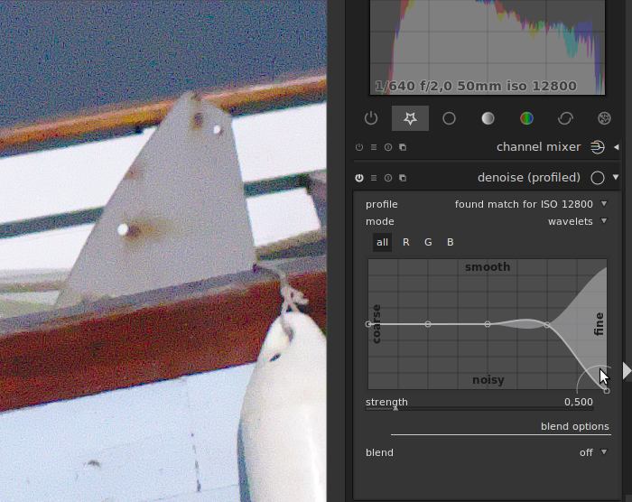
By playing with the different frequencies, on can get better trade-offs between smoothing and detail preservation.
In addition, new presets are now available for the denoise (profiled) module that exploits this curve:
-
one for chroma noise (false colors), where the denoising is increased for fine details, as the color should not change much from one pixel to another.
-
one for luma noise (false luminance), where the denoising is reduced on finest details and some coarse scales. It aims at providing a nice trade-off between noise and smoothing for pictures that are not too noisy (forget about extended ISO values for instance. For such pictures we have to use less automatic strategies).
The chroma preset should be used on the first instance, and the luma preset on the second instance.
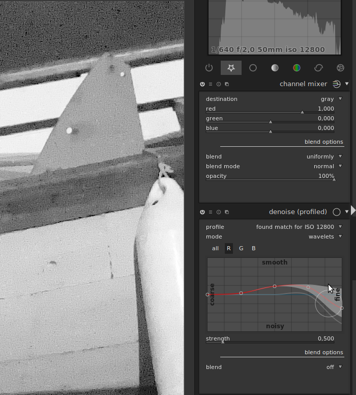
For images that are more complicated, or if you want to get an even better trade-off, you can use the RGB curves. Indeed, the sensors usually capture R, G, and B values. Depending on the lighting on the scene, the channels can exhibit different noise characteristics:
-
one of the channel may be more (or even much more) noisy than the other
-
one channel may have coarser noise than another
You can try to get a better denoising trade-off by denoising the channels separately, using the RGB curves and an instance of channel mixer used to visualize the channels:
Note that denoising RGB channels individually should be done before using an instance in color blend mode, as doing this will mix the channels and change the characteristics of noise.
These explanations were all using the denoise (profiled) module as an example, but you can follow the same steps with the raw denoise module. Also note that the tip of denoising RGB channels separately while visualizing the channels using the channel mixer is also useful to set the parameters of the denoise bilateral module.
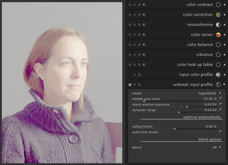
A new “log” mode for unbreak input profile
Similarly to the logarithmic shaper in the filmic module, the unbreak input profile module is now equipped with a logarithmic mode, with the same sliders and pickers. The difference is that unbreak input profile comes before the application of the input profile, while filmic comes later in the pipeline.
Using the log mode of unbreak input profile usually results in a pale image, lacking contrast. For example, on the Mairi Troisieme image, we may get this:
Getting a fade image is indeed the point: the logarithmic mode in unbreak input profile is meant to be used in conjunction with another module later in the pipeline to give more pep to the image (for example the color balance module, especially with the new features in this version). The advantage of this flow is that most of the pipeline, in particular the application of the input color profile, is done on an image that fills in the histogram properly, and without extreme values. In other words, we distinguish a technical part of the edit and an artistic part. Back to our image, the color balance module allows for example this:
Note that in this workflow, it is mandatory to work in the same order as the pipeline does: trying to adjust the settings of unbreak input profile after tuning the levels and contrast with color balance is doomed to failure.
In practice, the filmic module can do more or less the same, but has the advantage of having everything in a single module for a quicker edit.
Ability to adjust the opacity of each stoke in spot removal
The spot removal module benefited from some of the cool features of retouch. For example, it is now possible to set the opacity of the shapes individually (control+scroll).
Improvement of monochrome RAW files support
While it is possible to turn any RAW image into monochrome, some cameras have no color filters in front of their sensors, and produce monochrome RAW files. Previous versions of darktable allowed disabling the demosaic module for monochrome RAW. This version improves the treatment of these images further by disabling chromatic aberration correction, turn off the white balance module (if only to avoid spurious error messages), and re-enable normal processing such as auto-exposure which was disabled in previous versions.
Improvement of multiple modules instance support
Ability to rename module instances
When using multiple instances of the same module for different purposes, it is often hard to remember which instance serves which purpose. darktable now allows giving a name to each instance to simplify this. For example, if you use two instances of denoise profile, one for chrominance noise, and one for luminance noise, you may set the name of the first one as “chroma”, and the name of the second one as “luma”. The steps for setting the name of the chroma instance are described bellow:
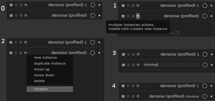
-
first, click on the “multiple instances action” button
-
click on “rename”
-
enter the name
-
press “enter” on your keyboard
Giving a name to a module instance is not only a convenient way to remember which one does what. Read on.
Copy-paste improvement
One of the strength of darktable is, thanks to its non-destructive nature, the ability to replay the history of one image on another one. A history can be saved as a style, or copied from one image to another (using control-c/control-v in lighttable or darkroom, or using the history stack module in lighttable). One difficulty, though, is to decide what should happen when copy-pasting a history containing one module to a target image where the module is already used. By default, darktable overrides the existing module with the one copy-pasted. However, when the same module is used for different purpose in the source and target images, this behavior is not satisfactory.
The behavior in darktable 2.6 is that when modules in the source and target images have different names, then both instances are kept. If they have the same name, then the copy-pasted one overrides the existing one.
One click to apply a preset in a new instance
Working with multiple instance of the same module is getting easier and easier. A common use-case is to create an instance for a given preset, for example the denoise (profiled) is often used with one instance to deal with luma noise, and another for chroma. With previous versions, this was done in several steps: 1) create a new instance, 2) apply the preset (4 clicks). It is now possible in a single step: open the “presets” menu, and use the middle button of the mouse instead of the left button to select the entry:
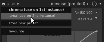
Note that the version after 2.6 will allow a middle click to open the preset menu, so that both clicks can be done with the same button.
Ratio-preserving crop in the perspective correction module
The perspective correction module now allows a semi-automatic cropping preserving the original image’s format:
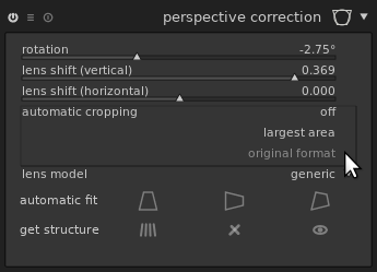
Just drag the mouse over the image to select the portion to crop:
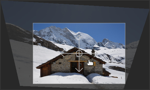
The area is adjusted automatically to avoid including black parts in the target image. This avoids having to switch to the crop and rotate module.
Usability improvements
Contextual help
darktable is a complex beast to master, and reading the manual for the feature you’re trying to use is often a good idea, even if you already read the full manual once.
This version introduces a contextual help to help users: a “?” button is available on the top-right of the interface, next to the “preferences” button:

Once clicked, the mouse turns into a question mark when hovering any element of the interface for which help is available:
One click opens your browser on the corresponding section of the documentation.
Module organization into tabs
The distribution of modules into groups, or tabs (“basic group”, “tone group”, “color group”, “correction group” and “effects group”) is now customizable. The original distribution in darktable follows a thematic categorization, but some users prefer grouping by stages in the workflow. For example, demosaic is currently categorized in the color group because it deals with colors, but it comes very early in the pipe hence may impact almost all other modules, hence it makes sense to categorize it in the basic group.
A re-categorization was proposed, but discussions between developers
couldn’t reach a consensus, since changing the groups may disturb
old-timers used to the legacy layout. The trade-off in darktable 2.6
is to have a customizable layout. You may change the layout manually
by editing the .config/darktable/darktablerc file, or use one of the
scripts provided in the source distribution of darktable:
tools/iop-layout.sh to adopt the new layout, and
tools/iop-layout-legacy.sh to revert to the legacy layout. Edit
these scripts if needed to create your custom layout. These scripts
are meant for advanced users who know how to execute a script, and may
or may not work on Windows. If a consensus is reached on the best
possible layout, it may be adopted in future releases of darktable so
that all users can benefit from it.
Note that this change only affects the GUI. Changing the distribution of modules in different groups does not affect the order in which modules are applied, which is still a fix order (from bottom to top in the GUI).
Tone curve
The user-interface of the tone curve has been improved in several ways. First, you can now use a log scale on the x axis, y axis, or both:
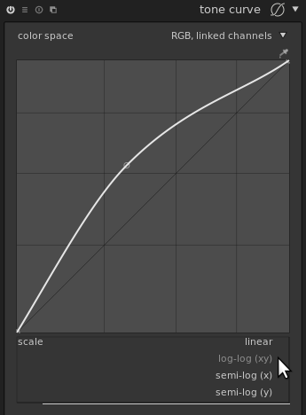
This makes it easier to manipulate points close to 0, i.e. finely tweak the part of the curve affecting shadows.
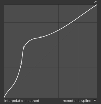
It is also possible to chose the algorithm used for interpolation, i.e. for computing the curve itself based on the control points edited by the user. There were already several algorithms available, but hidden to the user. For example, selecting the preset “contrast - high (linear)” was picking a cubic spline for you. For very smooth curves, the interpolation algorithm doesn’t change much on the result, but for curves using points close to each other it may make a dramatic change.
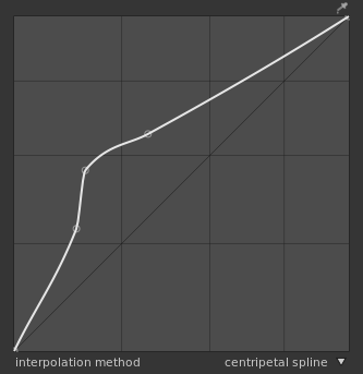
For example, let’s look at the same set of control points with different interpolations. The cubic spline gives a very smooth curve, but may give a non-monotonic result, i.e. a contrast inversion on the resulting image:
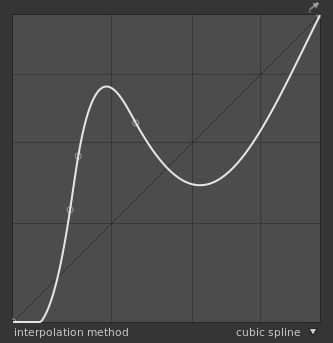
The centripetal spline reduces the potential for non-monotonicity:
The monotonic spline, used by default, may be less smooth but avoids non-monotonicity by construction:
More user-interface customizability through CSS
More widgets are themable through CSS. In particular, some widgets hardcoded a light foreground and black background so it was not possible to make a clean white background theme.
It is now possible to get a white background theme with, for example,
the following CSS (in a file named darktable.css in darktable’s
configuration directory, ~/.config/darktable/ on unix-based
systems):
/* White theme for darktable */

/*
 * Adapt the path below to the one of darktable 2.6's
 * darktable.css if needed.
 */
@import '/usr/share/darktable/darktable.css';

@define-color bg_color #eee;
@define-color plugin_bg_color #aaa;
@define-color fg_color #333;
@define-color base_color #444;
@define-color text_color #333;
@define-color selected_bg_color #eee;
@define-color selected_fg_color #666;
@define-color tooltip_bg_color #ddd;
@define-color tooltip_fg_color #eee;
@define-color really_dark_bg_color #eee;

@define-color darkroom_bg_color #fff;
@define-color darkroom_preview_bg_color shade(@darkroom_bg_color, .8);
@define-color lighttable_bg_color @darkroom_bg_color;
@define-color lighttable_preview_bg_color shade(@lighttable_bg_color, .8);

tooltip
{
    border-radius: 0pt;
}
#iop-plugin-ui
{
    border: 1pt solid #aaa;
}
The GUI will then have this aspect:
Note that with such setup, images will look darker, hence the aspect of the GUI may push the user to over-expose the images. A white background is interesting for people working on images meant to be displayed on white background, though. To avoid being influenced towards over- or under-exposing pictures, a grey theme like the following is much more advisable:
/* Grey theme for darktable */

/*
 * Adapt the path below to the one of darktable 2.6's
 * darktable.css if needed.
 */
@import '/usr/share/darktable/darktable.css';

@define-color bg_color #7F7F7F;
@define-color plugin_bg_color #333;
@define-color fg_color #eee;
@define-color base_color #444;
@define-color text_color #eee;
@define-color selected_bg_color #666;
@define-color selected_fg_color #eee;
@define-color tooltip_bg_color #BEBEBE;
@define-color tooltip_fg_color #111;
@define-color really_dark_bg_color #595959;

@define-color darkroom_bg_color #777777;
@define-color darkroom_preview_bg_color shade(@darkroom_bg_color, .8);
@define-color lighttable_bg_color @darkroom_bg_color;
@define-color lighttable_preview_bg_color shade(@lighttable_bg_color, .8);

tooltip
{
    border-radius: 0pt;
}
#iop-plugin-ui
{
  border: 1pt solid #707070;
}
Note that the thumbnails in the lighttable still use hardcoded grey colors, but they will be customizable in a future version too.
Other improvements
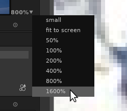
- 50%, 400%, 800% and 1600% zoom level are available in darkroom mode. While most operations provided by darktable are meant to improve the overall image tone and colors, it is sometimes interesting to get a precise pixel-level view of a small part of the image. The highest zoom factor previously available (200%) was not always sufficient, especially on high-dpi screens. Note that these zoom levels are available from the menu in the preview area, but not with mouse wheel.
-
All masks are previewed and can be adjusted before being drawn. This also applies to the liquify module’s shapes.
-
The color picker’s behavior has been reworked. For example the picker in the exposure module wasn’t disabled when the module was disabled. This is becoming more important as more and more modules use a color picker (filmic, unbreak input profile, color balance).
Import/export to other software
-
The Adobe Lightroom importer was improved (“creator”, “rights”, “title”, “description” metadata are copied from Lightroom to darktable).
-
A new script is provided to import collections from Capture One Pro (
tools/migrate_capture_one_pro.sqlin the source code of darktable).
About this article
This article is licensed under the terms of the Attribution 2.0 Generic (CC BY 2.0), or, at your option, the Creative Commons BY-NC-SA 3.0 License.
Contributors: jpg54, Matthieu Moy, Nilvus, rawfiner.

