

Figure 1: the gradient test image – download and play with it in darktable
People using image editors or similar (raster) graphics editors are probably familiar with histograms. You also have them in almost all digital cameras. In darktable you can find it very prominently in the top right corner of darkroom mode, but also as a backdrop of modules like levels, tonecurve and similar.
From a mathematical point of view they are a diagram displaying the amount of pixels in the image that have a specific colour, lightness, value or similar measure. The horizontal axis represents the brightness while the vertical axis corresponds to the amount of pixels that have that brightness.
From linear …
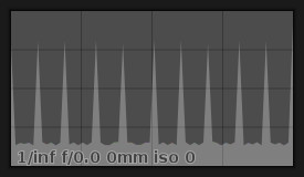
Figure 2: the linear histogram
Let’s look at the example picture in figure 1. For a bigger view you can click on all the images in this post. In the lower half it’s a smooth gradient from black to white. The upper half covers the same range but in bigger steps. When looking at figure 2 we see the histogram for that image: a (more or less) constant horizontal line with a few spikes. If we remember that the horizontal axis (x) goes from black (very left) to white (very right) and that the vertical axis (y) goes from “none at all” at the bottom to “quite a few” at the top then we can probably understand why we have this distinct look: breaking the image down we have the lower smooth part which has basically the same amount of pixels for every possible brightness, so we get the same y-value for every x-value – the horizontal line in the histogram. The spikes however come from the upper half of the image. Only 11 colours are represented there, with each bar having the same width. If we add these pixels to the count of the lower half we add quite a few to the score of the 11 brightnesses (i.e., x-values) of the upper colors. Thus we get the spikes since these have way more pixels in their bin than the smooth gradient steps in-between.
… to logarithmic
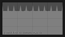
Figure 3: the logarithmic histogram
If you hover over the histogram you will find four little buttons on the top right. The leftmost can be used to switch the mode of the histogram, the others hide or show colour channels. The one we have seen in figure 2 is the so-called linear mode where the vertical axis corresponds 1:1 to the number of pixels – double the amount will lead to twice the height. This is handy when you want to see the fluctuation of the values in your image, however when there are a few brightness levels that are really common in an image they will generate a big spike. Due to scaling of the whole histogram (it has to fit into its window after all) you will hardly be able to see the rest of the shades as they will be cramped at the bottom of the histogram. For these cases there is the logarithmic mode which accentuates the smaller y-values. You can see the logarithmic histogram of our gradient image in figure 3. The base line coming from the smooth gradient is much higher and the spikes less pronounced.
Say hello to waveforms
As of version 1.4 of darktable there is also a third mode, the waveform. While it serves a similar purpose as the histogram – showing you what brightnesses there are in the image – it works a little different. The histogram just counts pixels with a specific value and doesn’t care about the location of that pixel in the image. The waveform however keeps that information. Therefore the meaning of the axes changes. The horizontal axis no longer denotes brightness but image location. Left in the waveform is left in the image, right in the waveform is right in the image. The vertical axis of the waveform represents the brightness. The third dimension of data, the number of pixels with a given brighness in a given pixel column of the image, is coded in the colour of the pixel in the waveform.
From theory to practice
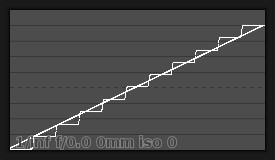
Figure 4: the waveform
All of this sounds more complicated than it really is. Let’s look at our grey test image again. You can see its waveform in figure 4. First we are again looking at the bottom half of the image. It has a smooth gradient from black on the left to white on the right. This results in a straight line from the lower left of the waveform to the upper right – on the left all the pixels are black, thus there is a white pixel in the waveform on the lower left. The further we go to the right in the image the brighter the pixels become. Subsequently the white marker in the waveform goes up on the vertical axis. Now for the top part, the steps. Sweeping over the image from left to right we find only black pixels for the first part, thus the corresponding columns in the waveform have white markers in the bottom. Next we see a bunch of slightly brighter pixels, resulting in a step in the waveform, and so on until we reach white on the right end. In theory you should see the waveform of this image in a middle grey with white points where the linear line of the lower part and the steps of the upper part overlap. We are however pushing the lower values a little to make them more visible (similar to the logarithmic histogram) so you see only white pixels in this case.
Time for a real world example
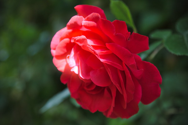
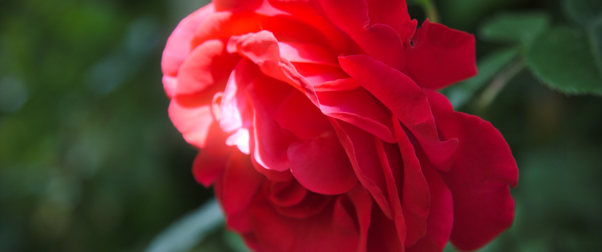
Figure 5: A rose by any other name …
Now that you have hopefully understood how histogram and waveform work we will have a look at how to interpret and make use of them.
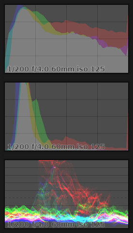
Figure 6: the rose histograms & waveform
(top – logarithmic; middle – linear; bottom – waveform)
Figure 5 shows a real world photo and figure 6 its histograms and waveform. Looking at the histogram we first notice that suddenly there are colors. This is because we don’t work with a monochrome image any longer. So each color channel gets its own histogram overlaid over the others. In the linear histogram you see that most pixels are quite dark with lots of slightly lighter green pixels. Almost all of the middle bright and brighter pixels are red. On the very right side of the histogram we see a red spike which tells us that the red channel has quite a few pixels that are at the maximum value – a sure sign that there was clipping. The logarithmic variant also shows that there are other colours than pure red in the brighter parts of the image. All of that can be seen in the waveform, too. There is a bright band of colours in the lower part, not touching the bottom line though – shadows are not crushed. And then there is the red thing in the middle, even touching the top border. These are the clipped pixels we spotted in the histogram already. But contrary to the former we can now even see where in the image the clipping occured: the middle. Looking at the rose we can confirm that. We can even see the greenish, sun lit twig on the bottom left of the blossom in the waveform as a dim green fog.
Next steps
With this in mind you should maybe browse through your gallery, noticing that low key photos have a big bump on the left of the histogram, high keys have it on the right, high contrast images might even show a peak on the left and right with a lower region in the middle of the histogram. All of which you can already evaluate in the field on the back of your camera.
For further reading about histograms refer to Wikipedia or the two articles from Cambridge in Colour (and part 2).


Is it true that the waveform provides the same data as that provided by the histogram but additionally provides some location data? The trade off seems to be that a waveform takes a few moments more to decipher.